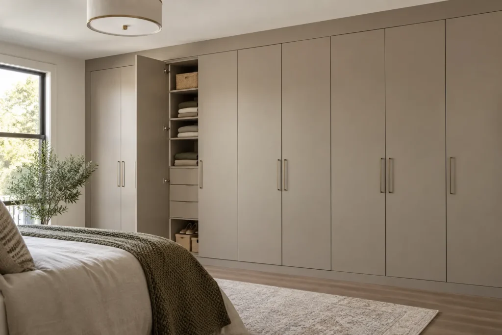
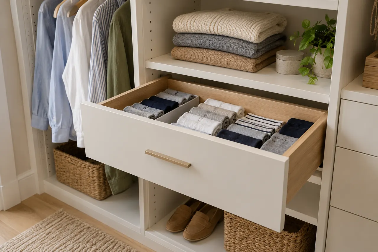
Look at the entire room before selecting a swatch
A finish viewed on its own can be deceptive. White surfaces may appear warm, cool, yellow or grey against different paint and trim. A wood-look panel can complement an oak floor or compete with it if undertones clash. Photograph the room in daylight and evening light, and compare a physical finish piece beside the actual wall, floor and door casing where possible. The size of a full cabinet face also changes the impression: a small dark swatch may look elegant, while an entire wall of the same tone can make a narrow room feel heavy.
Decide what visual job the storage should do. A closet interior can be quiet and legible; a dressing-room wall may be more expressive; a mudroom might need closed doors to contain visual clutter. If several rooms are being planned together, establish a family of tones and hardware rather than forcing the same exact panel everywhere. The layout and material should respond to each room.
Light finishes and where they help
Warm white, soft stone and pale neutrals can make storage interiors feel bright and allow clothing or small items to stand out. They are especially useful in closets with limited daylight. A light finish can help a shallow reach-in feel visually open, though the room’s paint, door style and lighting still affect the result. On a large built-in wall, an off-white tone often sits more comfortably with existing trim than a stark, cool white chosen in isolation.
Light is not maintenance-free. Scuffs, dust on exposed surfaces and marks around frequently handled edges can be visible. Consider where shoes, sports equipment or laundry baskets contact the surface. In a mudroom or garage, a warmer mid-tone or more easily maintained finish may be preferable in high-contact zones while lighter surfaces remain useful elsewhere. Material selection should include the practical question of how the family actually enters and uses the space.
Wood-look and darker palettes
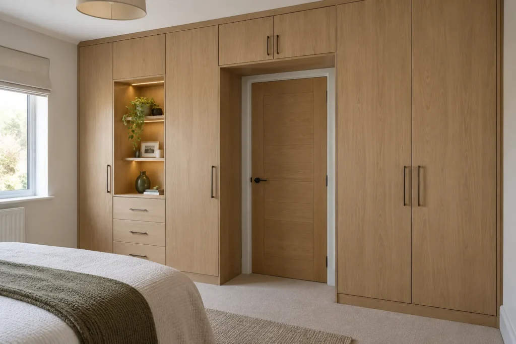
Wood-look finishes add grain and warmth without requiring every surface to become a decorative statement. A natural oak direction can connect to floors or furniture; a walnut tone can add depth in a larger bedroom or living room. Grain direction, edge treatment and the scale of the pattern matter on tall wardrobes and long shelves. If several panels meet, review how the grain will look across the elevation rather than judging a single isolated board.
Dark graphite, slate or rich wood tones can create a composed look, especially alongside good lighting and lighter surrounding surfaces. They may show dust, fingerprints or scratches differently from light finishes. They can also make the back of a deep cabinet harder to see. One solution is to use a darker exterior and a lighter, more legible interior. That choice adds a material transition to coordinate, so review the visible edges and opened-door view during design.
Open shelves, fronts and visible edges
The amount of exposed material affects the look as much as its colour. Open shelves put clothing, books and baskets on display, so their contents contribute to the palette. Closed doors calm the room but add faces, hinges and handle decisions. A mix can be effective: frequent, orderly items visible in open zones; less tidy or seasonal items enclosed. In a small room, do not assume every wall needs a full-height bank of fronts. Sometimes leaving one area open preserves light and a sense of space.
Front style should relate to the architecture. Simple flat fronts feel clean and contemporary; a restrained profile may sit better with traditional trim. Consider how door seams, drawer lines and hardware align. Unplanned small gaps or inconsistent divisions can be more distracting than the finish itself. The proposal should show the whole elevation, including exposed ends, toe areas and transitions at ceilings or side walls.
Choose hardware for hand and clearance
A knob, pull or integrated grip is both an appearance choice and a repeated touchpoint. Check whether it is comfortable for the person using it and whether it catches clothing in a narrow walk-in. Long pulls can look excellent on tall doors but need proportionate placement. If wardrobe fronts sit near a bedroom entry or adjacent cabinetry, project their opening path and hardware projection into the room. A beautiful handle that strikes a wall or blocks another door is not a successful detail.
Interior hardware also deserves attention. Drawer slides, hinges, rods and adjustable shelf supports influence operation. The exact specifications should match the intended use and the selected construction, especially for heavily loaded drawers or long shelves. Ask what is included and what is optional in the scope. Do not choose an accessory finish solely because it matches a photograph if the basic layout or access remains unresolved.
Materials should match storage conditions
A bedroom closet, laundry room and garage experience different demands. Laundry storage needs to respect appliance clearances, utility access and the possibility of incidental moisture or cleaning product contact. A garage can have temperature swings, wet footwear and bulky, heavy objects. That does not mean one universal material is suitable or unsuitable for every installation; the chosen panel, edge and hardware specifications should be checked for the actual setting.
Plan where shoes, wet coats, sports bags and cleaning products land. A removable mat, open cubby or easy-to-clean lower area might be more useful than repeating the same decorative finish from ceiling to floor. Very heavy items need appropriately designed support. If a wall has plumbing, vents, outlets or access panels, the storage design must respect them. Material appearance should never obscure maintenance and access requirements.
Coordinate existing floors, trim and lighting
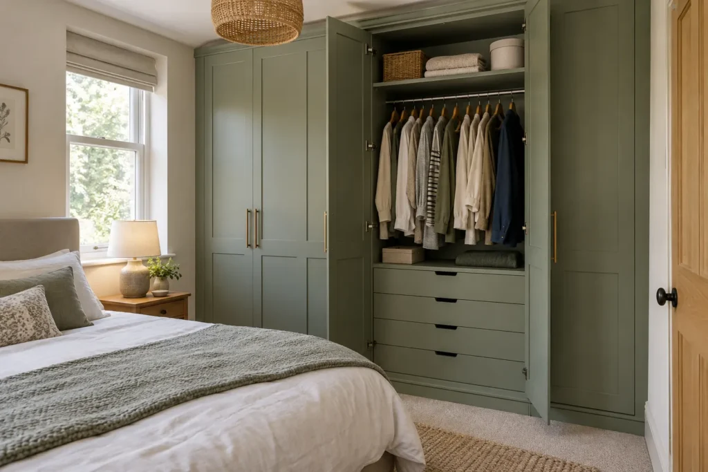
A new built-in often meets older construction at imperfect angles. Baseboards, crown detail, uneven floors and out-of-square walls affect how the finished unit meets the room. Before finalizing a visual, discuss whether trim will be retained, worked around or included in the installation scope. A rendering that ignores a deep baseboard or a nearby outlet may promise a cleaner result than the physical room allows.
Lighting changes colour and usability. Daylight near a window can reveal undertones; warm bedroom bulbs can make a pale finish look creamier. An enclosed closet may need general room lighting more than decorative shelf lighting. If integrated lighting is contemplated, coordinate power and any electrical work explicitly rather than assuming it is included. Place samples where they will live, and look at them at the times the space is most often used.
Review a finish decision as a complete specification
A useful finish review identifies the exposed panels, interiors, door and drawer fronts, edges, hardware and any contrast materials. It also clarifies what is existing and what will be changed. A phrase such as “light oak closet” does not answer whether the visible interior is oak, whether drawers have matching fronts, or what happens at the ceiling. Ask for a coherent scope so the final installed room matches the selected composition.
Balance personal taste with the life of the room. A child’s closet may need adaptable interior spacing; a primary wardrobe may justify a more considered front design; a pantry may prioritize clear visibility over a dramatic dark interior. See closet design options for layout decisions and whole-home planning for coordinating several rooms. Share photographs of your current finishes when requesting a consultation so the conversation begins with the actual setting.
Avoid the common finish decision traps
Do not choose the most elaborate front before confirming the opening and movement. Do not equate the most expensive material with the most useful storage. Avoid selecting from a screen alone when tone and texture matter; display settings change colour. And do not assume every visible surface must match exactly. A carefully limited contrast can clarify functional zones, while an exact match that clashes with the room’s existing flooring can feel less intentional.
If budget is constrained, put function first: sound access, useful proportions and appropriate construction. A restrained finish can still look composed through good alignment and thoughtful spacing. Conversely, a premium finish cannot compensate for drawers hidden behind a door or a walkway narrowed by an unnecessary island. The final decision should hold up when the storage is filled and used, not only when it is empty.